
What gets me are those that are rigid in their "rules". They try to make you think you need to conform to some sort of ancient code of honor carved in stone, and if you dare stray from it, your work will suffer immeasurably.
I, on the other hand, to quote Pirates Of The Caribbean --figured they were more actual guidelines-- and have always felt a bit of flexibility is in order. My shooting technique is relatively traditional, but definitely allows room for some "departures" from the norm in the name of style. I have always taught or given advice on photo composition with that philosophy in mind...
A perfect example of this is the idea of symmetry in a photo, which for the sake of this post, will loosely refer to centering a subject in the scene, or having nearly identical visual elements on opposing sides of a scene positioned horizontally in a mirror-like manner. Still with me?
Centering your subject, or having too much symmetry in a scene is often looked down upon by photo purists, as it is in direct violation of the magical Rule of Thirds or Golden Ratio. I'll let you do your own research on those two scared cows.
But I say nonsense! There is no good reason for you to place such arbitrary restrictions on your creativity.
Let's be clear: like many, I strive for an asymmetrical balance in the majority of my work, and if you're familiar with my shooting style, you know I love having visual elements receding into the frame or extending through it at all sorts of interesting angles to create a sense of depth and movement.
People especially are rarely placed in the exact center of my photos...
But IMO centering and shooting symmetrically is not evil, despite what many experts say. It should be considered a welcome change of pace for any photographer. You simply have to have a sense of what you're trying to express with this type of composition, frame your shots thoughtfully and carefully, and try not to be too repetitive.
Let me illustrate what I mean by showing some shots from a fashion test with Chicago model Adrianne Michelle (hair/mu: Stacey Lynn). We found a great location at the Illinois Institute of Technology in Chicago where the outside light was filtered through these heavily tinted orange windows (the color you see is redder, and was enhanced in post).
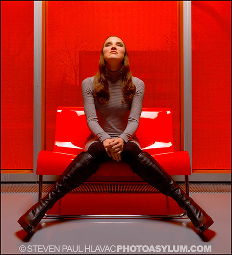
A symmetrical composition.
Because it was so easy to set up a symmetrical scene by placing the chair between two window frame sections, I decided to start out by posing her in symmetrical poses as well.
And that's one of the best reasons to center your subject and shoot symmetrically: to accentuate that visual effect and make it clear that was your intent. BTW, this is neither here nor there, but if you were observant enough, you may have noticed that's also Adrienne up top in my blog banner. Same shoot. But I digress...
One cool thing you can do with a symmetrical scene is easily create a bit of visual tension and interest by positioning one or more elements or subjects in an asymmetrical position within that scene.
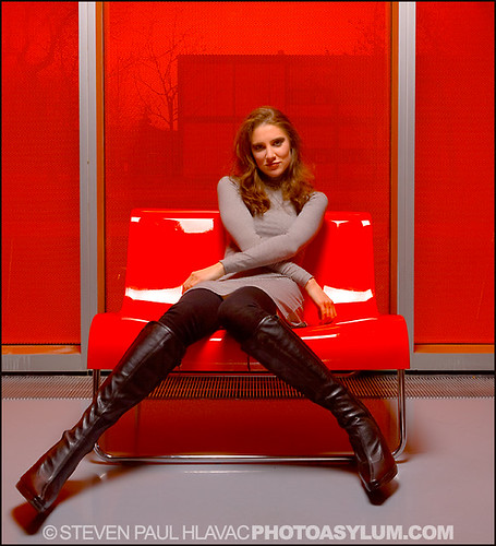
A mixture of symmetrical and asymmetrical elements.
Above is Adrienne demonstrating exactly that. Same basic camera angle and scene position, which means that most of the shot will still be symmetrical. But she changes her pose, and that makes a huge difference.
BTW, I often go through this routine in many of my shoots. I have a sort of fascination with human symmetry, even if it doesn't make its way into my final images, and many times I'll start the model out in a symmetrical pose, then move on to other things. It's a good visual and posing "warm-up". FWIW, if you're a model, a valuable exercise is to practice moving slowly in a strict symmetrical fashion. It's more challenging than it looks, and may help you out during your shoots.
Now, maybe you don't shoot fashion, or maybe you don't especially want the symmetry of a shot to jump out at the viewer as a style element.
Never fear. Symmetrical compositions work fine in portrait work as well, and they don't have to be rigid. In fact your shots will probably more effective if you soften the rules just a bit.
The portraits below illustrates an important guideline for centering your subject: try to use the environment or man-made structures, or even other people in the shot to frame the person.
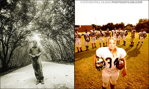
In both of these magazine portraits, neither the pose of the subject nor the background areas are perfectly symmetrical, so the effect is a bit more subtle. I also added a slight horizon tilt on the left that was part of my shooting style at the time. Not everyone's cup of tea, so shoot that sort of thing as you see fit. Oh, and if you're thinking the sky on the right looks a little washed-out, keep in mind the publication placed type there for the cover.
So, never let anyone make you feel guilty about centering your subject, or using a symmetrical composition. Just be sure to do it carefully, and with a sense of purpose, and you'll be fine...
All photos ©Steven Paul Hlavac.
No comments:
Post a Comment