Saturday, July 30, 2011

Photo Asylum 101: Get That Model Release: In The Photo!

Hopefully, if you're a commercial shooter, or publish your work in any way, shape, or form, you know full well the importance and advantages of having a signed model release from your subject. I'm not going to get into all that today. There are plenty of online resources to help you with releases, including this basic primer from ASMP.

What I would like to do instead, is suggest a good habit to get into when you shoot: snapping a frame or two of your model actually holding the signed release.

Now, every photographer will eventually figure out the way they like to work, but I almost always prefer to have my models sign their releases before we begin shooting. I'm easy-going, my sets are generally relaxed and fun, and most importantly, I have a laptop set up at some point to proof images. My point is there is a fairly high level of trust throughout the whole process, and the majority of models agree to sign without actually knowing precisely how they will be photographed.

One day it occurred to me that photographing the model actually holding the signed release would make a nice, convenient insurance policy, if you will. I have no idea of the legality of the photo should the original document become lost, but having the image right in the same folder as the rest of the shoot does a lot to alleviate any confusion or misunderstandings down the road. It also makes a very good reference file to send along to clients or publications that require documented releases of your models.

flickr-blog-pate-release
Model Robert Pate wouldn't dare deny signing his release as long as I have this!

As you can see, it takes very little effort to find a small piece of foamcore or cardboard (heck, even a small reflector) and attach the release. I like to combine it with my Macbeth Color Checker reference grid, and get both of these mundane tasks out of the way as quickly as possible, so I can focus my energy on the actual shoot.

On the rare occasion there is some hesitation from a model to sign off ahead of time, I simply do all of this at the end of the shoot.

So that's it. Sure, another step to remember to add to a seemingly endless list of steps, but a habit that, once you get into it, will help you be more organized and appear more professional in the long run.

All photos ©Steven Paul Hlavac.

Sunday, July 17, 2011

Photo Asylum 101: Symmetry Is Not A Four Letter Word.

Photographic composition can be a rather intimidating subject, at least when you're trying to learn to separate right from wrong, so you can get better at your craft. It's possible to find an almost unlimited amount of advice and opinions on what the rules of composing your pictures should be. And then when you consider that on any given occasion, most of those rules can be interpreted, stretched, broken, or simply ignored, the whole process can overwhelm the inexperienced photographer in a hurry.

What gets me are those that are rigid in their "rules". They try to make you think you need to conform to some sort of ancient code of honor carved in stone, and if you dare stray from it, your work will suffer immeasurably.

I, on the other hand, to quote Pirates Of The Caribbean --figured they were more actual guidelines-- and have always felt a bit of flexibility is in order. My shooting technique is relatively traditional, but definitely allows room for some "departures" from the norm in the name of style. I have always taught or given advice on photo composition with that philosophy in mind...

A perfect example of this is the idea of symmetry in a photo, which for the sake of this post, will loosely refer to centering a subject in the scene, or having nearly identical visual elements on opposing sides of a scene positioned horizontally in a mirror-like manner. Still with me?

Centering your subject, or having too much symmetry in a scene is often looked down upon by photo purists, as it is in direct violation of the magical Rule of Thirds or Golden Ratio. I'll let you do your own research on those two scared cows.

But I say nonsense! There is no good reason for you to place such arbitrary restrictions on your creativity.

Let's be clear: like many, I strive for an asymmetrical balance in the majority of my work, and if you're familiar with my shooting style, you know I love having visual elements receding into the frame or extending through it at all sorts of interesting angles to create a sense of depth and movement.

People especially are rarely placed in the exact center of my photos...

But IMO centering and shooting symmetrically is not evil, despite what many experts say. It should be considered a welcome change of pace for any photographer. You simply have to have a sense of what you're trying to express with this type of composition, frame your shots thoughtfully and carefully, and try not to be too repetitive.

Let me illustrate what I mean by showing some shots from a fashion test with Chicago model Adrianne Michelle (hair/mu: Stacey Lynn). We found a great location at the Illinois Institute of Technology in Chicago where the outside light was filtered through these heavily tinted orange windows (the color you see is redder, and was enhanced in post).


blogger-symmetry1
A symmetrical composition.

Because it was so easy to set up a symmetrical scene by placing the chair between two window frame sections, I decided to start out by posing her in symmetrical poses as well.

And that's one of the best reasons to center your subject and shoot symmetrically: to accentuate that visual effect and make it clear that was your intent. BTW, this is neither here nor there, but if you were observant enough, you may have noticed that's also Adrienne up top in my blog banner. Same shoot. But I digress...

One cool thing you can do with a symmetrical scene is easily create a bit of visual tension and interest by positioning one or more elements or subjects in an asymmetrical position within that scene.


blogger-symmetry2
A mixture of symmetrical and asymmetrical elements.

Above is Adrienne demonstrating exactly that. Same basic camera angle and scene position, which means that most of the shot will still be symmetrical. But she changes her pose, and that makes a huge difference.

BTW, I often go through this routine in many of my shoots. I have a sort of fascination with human symmetry, even if it doesn't make its way into my final images, and many times I'll start the model out in a symmetrical pose, then move on to other things. It's a good visual and posing "warm-up". FWIW, if you're a model, a valuable exercise is to practice moving slowly in a strict symmetrical fashion. It's more challenging than it looks, and may help you out during your shoots.

Now, maybe you don't shoot fashion, or maybe you don't especially want the symmetry of a shot to jump out at the viewer as a style element.

Never fear. Symmetrical compositions work fine in portrait work as well, and they don't have to be rigid. In fact your shots will probably more effective if you soften the rules just a bit.

The portraits below illustrates an important guideline for centering your subject: try to use the environment or man-made structures, or even other people in the shot to frame the person.


flickr-blog-portrait-symmetry 
Symmetry can work nicely in portraits as well.

In both of these magazine portraits, neither the pose of the subject nor the background areas are perfectly symmetrical, so the effect is a bit more subtle. I also added a slight horizon tilt on the left that was part of my shooting style at the time. Not everyone's cup of tea, so shoot that sort of thing as you see fit. Oh, and if you're thinking the sky on the right looks a little washed-out, keep in mind the publication placed type there for the cover.

So, never let anyone make you feel guilty about centering your subject, or using a symmetrical composition. Just be sure to do it carefully, and with a sense of purpose, and you'll be fine...

All photos ©Steven Paul Hlavac.

Wednesday, July 13, 2011

Summer 2011 Issue Of PULSE MAGAZINE Now Out!

The new issue of PULSE MAGAZINE is now on the street. Pulse, of course, being a nice little glossy covering art, music, writing, dining, and other assorted cultural diversions in the Lake County cities of Mount Dora, Eustis, and Tavares.

As it so happens, I do have ulterior motives for touting the new issue. Inside, my full-page shot accompanies a fun feature by writer Tony Marzano on local legend Dr. Edgar James Banks, a turn-of-the-century archeological adventurer and college lecturer often credited as the inspiration for the Indiana Jones character of Hollywood movie fame.

It was shot at the nearby Eustis Historical Museum, which has an entire room dedicated to Dr. Banks, a re-creation of one of his bedrooms with some assorted personal items and other props from that period.

So, look around, and pick up a copy when you get the chance. For those of you outside the Central Florida distribution area, check out the PULSE MAGAZINE web site.

Monday, July 11, 2011

Photo Asylum 101: Holy Crop! Photographers PLEASE Keep Those Model's Hands And Feet inside the frame!

As I look at much of the fashion photography being posted online by younger shooters (and this is mostly self-publishing, not actual magazines), I'm a bit stunned by the number you that don't seem to have a firm grasp on the fine (and I have to assume elusive) art of cropping an image.

As a photographer, you have three opportunities to crop a photo. Once when you compose in the camera. Again when you crop making the print in either a wet darkroom or on a computer. And finally when you present a printed photo by trimming and/or window matting it.

Now, in a sense, composing and cropping an image go hand in hand, as they are essentially the same thing. By cropping, you are altering the composition of your shot. Obviously, the nice thing about cropping is you can do it after the fact, often correcting mistakes or making the composition of a pic stronger after you've had time to look at and think about it.

And much like the art of composition, the full art of cropping is way too encompassing to get into here. So I'll simply deal with one small aspect. One tiny, yet incredibly annoying aspect of cropping fashion photos that I spot with disturbing regularity: cutting off your model's hands at the wrists or feet at the ankles.

Now, let me be clear: you have the right to pose your model, then compose your frame and eventually crop your shot in any way, shape, or form that you see fit. Far be it from me to tell you how to create your own art.

But I see things through the eyes of someone who's shot editorial and advertising work for a lot of publications, and worked with many Editors and Art Directors over the years. To have your work accepted and respected in a larger and much more critical world, you can't just have a free-for-all going on in your photo.

Random doesn't usually work. The way you crop is critical to whether the image is successful or not, and in the commercial world, other people's opinions do count.

Think of it like this: you can drive your car like a madman in your own back yard to your heart's content, but at some point, if you decide to venture out onto the street in the real world, you need to know the "rules of the road", because they do exist.

So, with that in mind, let me start by saying arms and legs at the edge of a frame with either the hands cut off at the wrists or feet cut off at the ankles tends to look really bad.

Really. Bad. Whether you realize it or not...

So, assuming you do not want a full-length shot, where do you crop? Easy. You crop much further up the arms or legs. When you do that, it appears to the eye that those body parts are simply out of the frame. Nothing unusual.

On the other hand, when hands and feet are cropped at the wrists or ankles, it actually appears that those parts are missing, and makes the overall composition look very awkward, or even freakish.

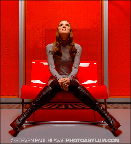
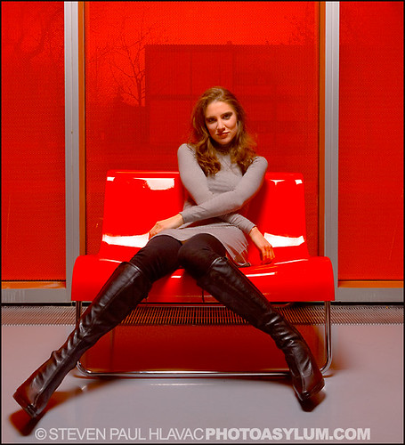
To our left here is a perfect example. Our beautiful model Lucy Marchany (agency: Wihelmina New York) has graciously volunteered to let me slice and dice her lower extremities at various spots in the interest of advancing cropping knowledge for all humanity. What a sport. In return, I promised to buy her new boots. I'm sure you can see the irony...

Now, the shot on the left is properly cropped. A symmetrical composition cut off just above the knees. It looks perfectly natural, what we would call a three-quarter length shot. There is enough of her legs out of the frame that our eyes don't even think about it. They instead concentrate on the part of her that we can see.

The pic on the left is poorly cropped. Lucy's legs lead the viewer's eyes all the way down to where her feet should be. And because of that, you expect to see her feet. When you can't, it seems as though they've been removed. Taken away. Missing. It looks unsettling.

Here is an example of the wrong and right way to crop a model's hands in a shot. Poor Chevonne in the first pic looks like she was involved in some horrible industrial accident that lopped off her left hand. And she's married no less. You can imagine her anguish. Russian beauty Svetlana on the right has her left arm flow smoothly out of the frame, the crop done much higher up the arm and at an angle.

Now, as much as I try to refrain from pointing fingers at any specific individuals with these "lessons", I feel I have to mention a photographer whose online book I viewed recently. Not by name, of course...

They had many shots of extremely attractive models in some very good poses, but almost all of the pics have the poor girls' feet cut off. Yep, you guessed it: at the ankles. It was so odd because it was done so consistently throughout their portfolio. As I've been saying, it would have been much better to either show the models' feet entirely, or crop much higher up on the legs.

What's even worse is many of the shots gave credit to a Wardrobe Stylist, making it quite bizarre, as this stylist was either too lazy or didn't have the resources to pull shoes for these shoots (shoes obviously being one of the most important styling elements of any fashion shoot). Either that, or they simply didn't care that their hard work was eventually cropped out of the photos.

My point is even talented shooters can show they are completely clueless about certain things, and this obvious and easily fixed issue, IMO completely ruined their portfolio. Much like my initial reaction, an Art Director or Photo Editor would cringe viewing the work.


So class, pay careful attention to your in-camera composing, and especially your post-process cropping. Let's either keep those hands and feet safely inside the frame, or crop them out the correct way...

All photos ©Steven Paul Hlavac.

Monday, July 4, 2011

Get Ready For PHOTO ASYLUM 101...

Now, I know for many of you, school is out for the summer, but here at The Photo Asylum, the learning process never stops. Never...

And so, I'll soon be starting a series of blog posts under the common heading of Photo Asylum 101.

The subject matter of these posts will vary widely. Any and all things relating to photography including lighting, shooting, pre and post-production, composition, studio and location gear, presentation, you name it.

Also, various aspects of the fashion business, specifically as they relate to organizing and producing fashion shoots. Styling, casting, location scouting, video, etc.

Sometimes these posts will start with a particular criticism. Something I see being done wrong or poorly. The emphasis will never be on the negativity of the mistakes or the bad habits, but rather my suggestions for perhaps ways of doing things a bit better. Persuade rather than admonish.

Other times these will just be straight-forward, short tutorials, simply explaining a rule, technique, or way I've learned to do something that I want to pass along. Again, a suggestion. Just something for you to consider.

My intention will always be to improve your way of working, and as with most things in life, you are free to embrace or ignore my advice.

So, get ready. There will be a test at the end of the semester...

Friday, July 1, 2011

Fire Up The Works! And Get Great Photos Of Them...

There are certain impressive visual displays in life that I admire and sometimes even marvel at, but never really have the urge to photograph. Rainbows and lightning come to mind. I truly appreciate them, but have little or no interest in capturing them in a photo.

Fireworks also fall into that category. Don't get me wrong. I love a good fireworks show, and have many many wonderful memories of seeing them with friends and family, mostly from when I was little.

It's just that, for me, it's all about witnessing these things as large as life in real-time with real people. I find photos rarely come close to capturing that experience.

But I completely understand folks' desire to get great (or even good) fireworks pictures. The line between classic theme and cliché is sometimes a thin one, and I think fireworks qualify as both.

Still, it can be quite a challenge, and with that in mind, I'd like to point you to a very good guide to making those images memorable from photographyreview.com:

Fireworks Photography Tips

Now, if you follow these guidelines, I think you'll find it's not too terribly difficult. But it may require you to shoot in a much more traditional manner: using a tripod and camera with manually adjustable settings. If you notice my pathetically blurry fireworks pic above, you can plainly see what happens when one tries to use a meager point & shoot (handheld no less) to do the work of a DSLR...

Obviously, in this age of smart phones, many of you will simply use your phone cameras to shoot the fireworks display. Or at least try. I really have no idea what kind of results you will get, but if that's your plan, I wish you the best of luck. Maybe you'll be pleasantly surprised.

Have a great FOURTH everyone!

Thursday, June 30, 2011

An 'Image Creator' No More: My New Photography Business Plan - Part 2

PLEASE NOTE: this is Part 2 of a two-part post (eh, hence the name). I strongly recommend you read Part 1 first.

Let me resume my discourse on the demise of the "image creating" business by first admitting I pulled a Jedi Blog Trick in that first post. I painted a dire, dramatic sky is falling picture of the photography business that may have startled some. While fairly accurate, it only gave you a tiny piece of the big picture, and represents just part of a much larger industry.

The ASMP Director Eugene Mopsik commentary column I quoted from is aimed (as is ASMP itself) primarily at commercial editorial and advertising photographers whose main income comes from licensing their published work.

These are the professionals who are most in need of re-inventing themselves. The group that is seeing their older, traditional business plans crumble as a result of the digital imaging revolution. Over the years, much of my work has fallen under this category.

There are many other types of photography-related businesses and careers. For those of you moving along a slightly different path, you may find that opportunities abound, and the health of your niche in the imaging world may indeed be robust. It is, after all, a very complicated and fluid business.

To reiterate the main point of Mopsik's column, for this specific group of photographers:

Survival is contingent on the establishment of multiple income streams...

Now, this advice fits me to a T, and it is exactly where my head has been "at" for quite a few years now. It is just reassuring to see it spelled out by a respected industry professional. Makes me feel I'm not alone in this battle.

So, with that in mind, here is my New Photography Business Plan, which as I just said, is not really new, but as we enter the second half of 2011, is worth re-focusing on.

FASHION - This is one of my biggest gambles. I have not shot a serious editorial fashion project in over five years. That's an eternity in the business, and it's due in part to the poor market (and attitude) here in Central Florida.

Still, I think enough progress has been made here recently that, with all the great shoot ideas I have rattling around in my head, the time has come to have another go at it. The plan is to test, shoot for Style Bedlam Magazine (see below), and hopefully that will lead to editorial and advertising print work. I feel my renewed effort will either open up the floodgates to an exciting new chapter in my career, or end up just being another lesson in futility.

VIDEO - This what really has me psyched, and it ties in nicely to my return to fashion. Still shooters have been making the transition to video for quite some time now, and if they haven't already, many will need to eventually in order to survive.

I am not freaked out or intimidated by this in the least, for reasons I will cover thoroughly in a future blog. Let's just say that my years of storytelling and thinking cinematically with my still work gives me many of the skills needed to direct and produce motion. I don't see this replacing my still shooting, but rather supplementing it.


STYLE BEDLAM MAGAZINE - An enormous web project for the fall of 2011. It ties in directly to the two things listed above. Starting my own online publication, however humble, is the ultimate self-assignment experience. I am trying to make this a complete magazine with fashion editorials, music and art features, and whatever the hell else I can throw in there that's slightly off-kilter. It will hopefully provide the perfect vehicle for me to network and collaborate with creatives from many different fields and markets. And, it will serve as my premiere marketing tool.

STOCK PHOTOGRAPHY - I hate stock photography. I have always hated stock photography. It is the polar opposite of everything I have learned to shoot over my career. Most stock is generic and anonymous. And in this micro stock market, it pays pennies. That being said, in today's WWW world, and considering the vast amount of archive images I have, plus the fact that most micro stock web sites allow you to join for free, it makes no sense for me not to offer an assortment of my photography as stock. A modest amount of effort to set everything up, and the web makes the work available to potential clients 24/7/365.

ZAZZLE - DEVIANT ART - FINE ART AMERICA - ETSY - Despite the lack of success of my gallery work since I've relocated (another strike against Central Florida), it fuels my soul too much for me to give up on it. And so I continually go in search of other, more worthy markets. The web has made that much, much easier. The names you see listed here are all art & design online stores, and they all allow me to easily market and sell my work in one form or another. All over the world. All free (or for a nominal listing fee). Persistence with these sites produces results. Wish I could say the same thing for where I live.

PHOTOGRAPHY WORKSHOPS - I have taught photography on and off in the past, and currently give away a tremendous amount of free advice and information on web forums, my Facebook Page, and now this blog. But there is a part of me that feels I can market myself a bit better and in a more structured environment by offering actual professional workshops. Again, I would tie this in to my fashion and portrait work, with the emphasis on studio lighting. It is very tempting, as I get a lot of satisfaction from teaching, but will require a lot of work on my part as well.

Well, that's the gist of it. I have an assortment of other art or photo-related projects designed to produce income, but these are the major categories that I'm concentrating on. A shotgun approach to be sure, and one that will require a lot of juggling, but one that I am confident will work. And the irony of it all is that I will remain an image creator, and that sure is a relief...

All photos ©Steven Paul Hlavac.

Wednesday, June 29, 2011

'The Mouth That Roared' Is Here To Stay...

In this New Digital Dawn, everyone and their cousin thinks they're an expert on social media and how to use it effectively. Especially when it comes to business.

And, as much as I enjoy hearing a wide variety of opinions and views on most anything, I rarely take someone's advice on such important matters at face value. Rather, I kinda soak it all in, repeat my mantra of "consider the source" a few times, then try to decide if it makes any sense for my situation.

Many of us have very different business and career goals, so a blanket or one-size-fits-all policy on how to harness the vast array of social media resources out there is rarely going to be the best one to latch on to.

Yet, every so often a precious nugget of wisdom that would appear to be universal rises to the surface, so I greedily grab it with both hands, and simply wonder why anyone would not want to add it to their toolbox.

What am I talking about? A quote from a true social media expert (at least IMO) that basically gives me the green light to do what I do best, and tells me I will very likely be more successful for doing it.

Now, I must apologize, as I cannot remember where I read this or who even said it. I know that's bad, and I would love to give them the credit they deserve, but truth is, for the sake of this post, it doesn't really matter.

And so I will paraphrase heavily...

This person basically said that the key to effective use of social media is to have an impact: project your knowledge and personality in a fun and large way that sets you apart, gets people's attention, and makes them want to participate in what you have to offer.

Fun and large way. Makes them want to participate. Interact. Establish a dialogue...

I know what you're thinking. How is that profound? Everyone offers that advice. It's just common sense. True, but I haven't gotten to the profound part yet.

This person goes on to say that the single biggest mistake someone can make using social media is to abandon that boisterous voice and softly water down their message in an attempt to be all things to all people.

Water down their message in an attempt to be all things to all people.

As someone who has been guilty of doing that very thing on my Facebook Page, this pronouncement quickly got my attention.

The worlds of commercial and fine art photography are truly wonderful, with great rewards for those that have the talent and the work ethic to stay the course. But they are also highly competitive, often superficial and petty, and absolutely cutthroat at times.

I believe in a strong sense of self and purpose, the art of defending and persuading, sticking to my guns, and most importantly, fighting the good fight when its called for. It's called debate, and I think we are all the better for it when done properly and with respect.

Still, not everyone has the stomach for these sorts of battles, which is why overly defensive and soft and fuzzy I'm OK! You're OK! personalities abound on the web, at least when it comes to photography, with the message that no one should dare say anything the least bit critical, lest we hurt someone's feelings.

My mistaken reaction to this "everyone's photography is awesome" mentality has been to soften my stance, in effect lower my standards so as not to ruffle anyone's feathers, in some misguided attempt to get as many people to like me as possible.

While this game plan did in fact win me many new fans, it also effectively muffled much of my personality and voice, effectively blending me back into the crowd with all the other "nice" people. And in some ways I was miserable because of it.

The world of mediocrity was being shoved down my throat, and I was suppose to muzzle myself and not speak up.

So, you can only imagine how liberating my social media friend's magnificent words were to read and ponder. It was literally a glorious validation of my very heart and soul.

Don't get me wrong. I don't take this as a license to be mean-spirited or hurtful. I have never been, nor never will be those things. It is possible to be critical in a constructive way and still remain nurturing and positive. Trust me on this one...

But what it does is give me permission, better yet, tell me it's my sworn duty to stir things up!

You heard me. STIR THINGS UP...

In my book, yeah that means maybe smacking people around verbally on occasion, but always in a thoughtful or maybe humorous way, the goal being to help those that truly seek it and want to grow in this business. It is absolutely acceptable to point out someone's mistakes in an attempt to help them learn from them.

And so, with all due pomp and fanfare, I hearby declare that I WALK ON EGGSHELLS NO MORE!

Some of you will thank me for this later...

Monday, June 27, 2011

An 'Image Creator' No More: My New Photography Business Plan - Part 1

I was pouring through the latest issue of the ASMP Bulletin (American Society of Media Photographers), and there in Director Eugene Mopsik's commentary column, it hit me. Square in the face. The "inconvenient truth", one I have tried desperately to avoid facing for so long, reared its ugly head and looked me straight in the eye.

According to Mopsik,
"Recent changes in the industry, economy, and society have created a perfect storm — the transition to digital capture, digital distribution, the explosion of digital media outlets, the rise of the talented amateur, all coupled with a dilution of effective copyright protection have made it virtually impossible for a commercial photographer to sustain a career solely as an image creator."

Please read that last part carefully.

Virtually impossible...to sustain a career solely as an image creator.

If true, that, my friends, is a bit of dream-killer. A snuffer, if you will, of one's long-time career goals and lifelong passion. Including mine.

In layman's terms - simply the end. Game over. Give it up. Time to get a real job...

Now, normally someone in my position - a longtime freelancer, struggling but determined to get my career rolling again - would read this "doomsday prophecy" from a knowledgeable industry insider, and immediately get nauseous, light-headed, and quite possibly faint. Or maybe cry a little. After all, who would blame me for taking this news badly?

I had become The Little Engine That Couldn't...

Fortunately, I am a "glass is half full" kinda guy. Not only that, but I can actually see the waiter coming over to fill it the rest of the way. Let's just say I try to stay extremely positive, even under the most stressful and challenging circumstances that life throws at me.

I continued reading...

Mopsik goes on to say,
"While the photography community is working diligently to navigate this new world and take advantage of the enormous new opportunities it presents, the print-to-pixel revolution has been as disruptive to professional photographers as it has been to publishing and electronic media. For many, survival is contingent on the establishment of multiple income streams."

Well, there you have it! Mopsik's dire observation is quickly tempered with a logical and hopeful solution!

I'm saved! We are all saved! Huzzah!

Seriously, it is worth repeating:

Survival is contingent on the establishment of multiple income streams.

And with that declaration nestled firmly in my brain, the "real" truth finally emerged, and I realized it was not inconvenient at all.

Nothing Mopsik disclosed was a surprise to me, let alone a shock. Deep inside, I knew his words were true, and had known for quite some time. In fact, the writing on the wall had taken place literally years ago. At least if you were paying attention...

So, to salvage my sagging career, it is not a question of suddenly taking his advice to heart and coming up with a new plan to "establish multiple income streams", but rather just keep working on the plan that I already have in place. A plan that I'm pretty damn sure will work.

And what exactly is that plan? Well, to learn that, you'll just have to wait for Part 2...

Sunday, June 26, 2011

Photographyreview.com Studio & Lighting Forum Is The Place To Be...

I'm the moderator with my pocket calculator...

Do you use lighting in your photography? Of course you do. What a silly question. That's what photography is. But do you use artificial lighting in your photographs? Well, chances are you do that as well.

If that's the case, I'd like to mention that I moderate the fun and informative
Studio & Lighting Forum on the always spectacular photographyreview.com web site.

The forum is a great place to learn or share information on lighting, as well as all things related to working in the studio. All are welcome and made to feel comfortable, from the absolute newbie to the seasoned, veteran pro. Topics discussed range from choosing new lighting gear, lighting setups for particular shots, inexpensive alternatives to pricey studio grip equipment, and of course troubleshooting individual problems with your lighting or studio setup. Trust me, there's a little something for everyone.

My job, of course, is to keep everyone in line, and to make sure we all play nice. Not too difficult with the great group of members we have on the site. And registration is free...

With my return to shooting editorial fashion in the coming months, I plan on spending much more time on the forum, and will be making it a priority to share my shoots and how they were planned and carried out.

What better time to come aboard and be a part of it?

Saturday, June 25, 2011

"Endeavor To Persevere..."

Sometimes this simple quote is enough to keep me going. Especially considering the original source...

Spoken by wonderful Native American actor Chief Dan George's character Lone Watie in the classic Clint Eastwood western, The Outlaw Josey Wales, it has become one of those larger-than-life movie quotes taken from Hollywood but applied often to real life. George's role in the picture, while played mostly for deadpan comic effect, closely mirrors that of actual American Indians throughout our history.

And so, for him to continually utter the phrase in the face of his monumental struggle, it becomes easy to transfer it and its meaning to the more mundane challenges we face in our modern lives.

Endeavor to persevere. Strive to make the effort. Keep on keepin' on. Never give up. However you want to package the words, they remain a potent reminder.

Not of the solution. But of those first steps towards it...

Thursday, June 23, 2011

Hit A Roadblock With Your Portrait Photography? Let's Round Up The Usual Suspects...

I taught a handful of photography subjects during my time living in South Florida, from black & white film and print processing, to studio lighting, to photo composition and critique. All were satisfying, as they helped open up new worlds to students, giving them tools to further their work, sometimes in surprisingly wonderful ways. But the most enjoyable by far were my classes on photo composition.

Sure, the equipment can be fun, the shooting can be fun, and the process can be fun, but what I tend to cherish most about photography is viewing and talking about photos. My photos. Your photos. Their photos.

And so, with that in mind, I'd like to pass along a little easy-to-remember visualization tool for making your photos (especially your people shots) stronger. I came up with this technique years ago, and it was usually the very first thing I taught my students. Not to brag, but sometimes the improvement of their images between the first class and the second was dramatic. Kind of like flipping a switch. Even if you've been doing this photography stuff for a while, you may find it helpful.

Start by picturing one of the most straight-forward, flat, unemotional, boring visual scenes out there: your typical police lineup. Here's a very well-known example:

Now, just for a second, try to ignore the fact that these are Hollywood actors projecting oddball personalities as part of the plot of the movie. If these were just your "average Joes" rounded up and used for a standard police lineup, trust me, this would be a very boring picture.

As I'm sure you realize, a police lineup intentionally lacks any kind of visual style. It is evenly lit, the subjects are evenly and symmetrically spread out, standing straight up and looking eyes forward, expressionless. They are all the exact same distance from the viewer. Everything is in focus. It's sole purpose is to impart clear and accurate information to the viewer.

Ok, now the fun part. If you start with this bland composition, any deviation from it will result in a stronger and more interesting photo. Think about that...

So, take your pick. Raise or lower your camera angle? The shot gets stronger. Angle your background so it recedes into the frame? The shot gets stronger. Group multiple subjects closer to one another asymmetrically or at different heights or distances? The shot gets stronger. Have your subjects interact and show emotions? The shot gets stronger. Throw parts of your scene out of focus? Move your light source around? Well, you get the idea...

That's really all there is to it. When you pose your subjects in photos, if you're struggling with your composition, try to keep the image of a police lineup in your head, and avoid its compositional pitfalls at all costs. Even if your portrait is of a single person, the visualization will usually hold true.

Class dismissed...

Tuesday, February 8, 2011

And To Think, I've Been Here The Whole Time...

O...M...G!  Has it really been all these months since my last blog post? That's really hard to believe, considering how many things I have going on inside my head at any given moment, and also how much I like to talk about them.

But then again, maybe not, as I've gotten into the habit, like many of you, of posting many of my thoughts, ideas, and career events on my Facebook pages with great regularity.

Still, my blog needs to be an important part of my online presence. It should be informative, fun, and timely, or else why even have it?

So, with that in mind, I (also like many of you) have made one of my goals for the new year to be keeping this beast fed on a regular basis, and making a better effort to funnel my career and industry news and advice through this megaphone.


BTW, you are more than welcome to join my posse at my Photo Asylum Facebook Fan Page

Wow, this is like, ya know? A timely and informative blog entry! So far, it looks like I'm sticking to my goal. Awesome!